A Multiple Box Shadow Generator is a free, user-friendly tool that allows you to create and layer multiple shadow effects on a single HTML element using CSS. You can adjust settings such as offset, blur, spread, and color for each shadow layer to achieve complex, professional-looking effects. The tool provides real-time previews on various shapes—like boxes, circles, or headers—and instantly generates the corresponding CSS code, ready to use in your project.
Understanding the box-shadow Property
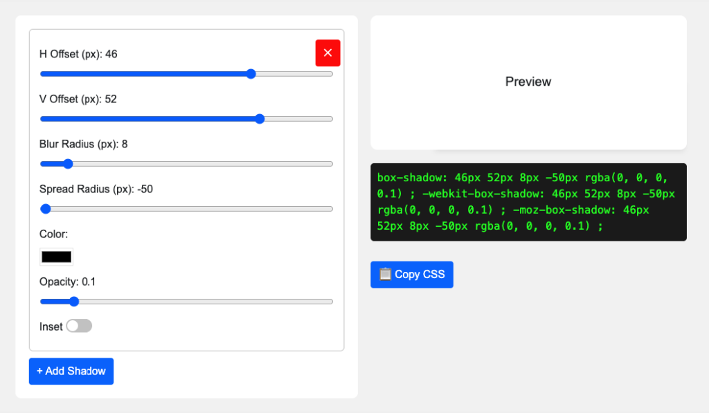
To apply a shadow using CSS, you’ll need to understand the different values that make up the box-shadow property. Here’s a quick breakdown of what each part does. Optional values are in parentheses:
Inset: This optional keyword changes the shadow from outside (default) to inside the element. Simply add “inset” to make the shadow appear inward.
Horizontal Offset (h-offset): This sets how far the shadow moves horizontally from the element. A negative value moves it to the left; a positive one moves it to the right.
Vertical Offset (v-offset): This determines the vertical position of the shadow. Negative values shift it upward, while positive ones push it downward.
Blur Radius: Controls how soft or sharp the shadow edges are. Higher values create a more diffused look. If not set, it defaults to zero.
Spread Radius: This affects the size of the shadow. Positive values expand it, while negative ones shrink it. It’s optional and defaults to zero if left out.
Color: Specifies the shadow color. This is a required value.
How to Use the Tool
Adjust the horizontal offset, vertical offset, blur, and spread using the sliders or input fields.
Adjust the horizontal offset, vertical offset, blur, and spread using the sliders or input fields.
Choose background and box colors for visual reference. These won’t appear in the final CSS—only the shadow color will.
Enable the “inset” option if you want the shadow to appear inside the element.
Click + Icon to add more box-shadows.
Once you’re happy with the result, simply copy the CSS code manually or with the “Copy CSS” button.
This tool enables you to quickly and easily experiment with various shadow styles and generate production-ready code for your web projects.
Didn't find what you want?
Don't be sad. We are here for your help. Just request a quote and we will come up for your solution.
We use cookies to ensure that we give you the best experience on our website. If you continue to use this site we will assume that you are happy with it.